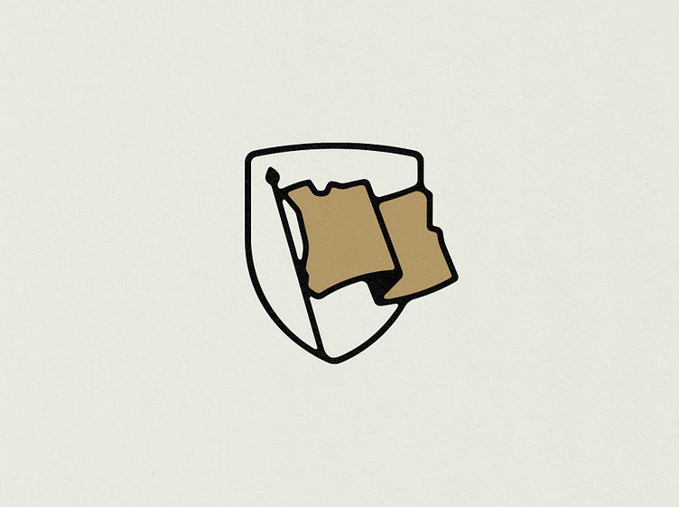
Oregon Flag
This was one of those circumstances where you desperately want a concept to work, but ultimately can’t get past the finish line. I (personally) gravitate towards marks that aren't immediately registered. Some say this pushes against at the core of "successful logos", but that belief feels a bit underdone to me. There's something to the 'second look' - a mark that rewards engagement and draws you into a deeper space with it and sticks with you long after.
The force was marrying the Oregon state shape with a flag. And it kindaaaa works! It just didn’t register quick enough to a chunk of people during development, which is fair. My jaded eyes have a lot of love for it. And while it didn’t work as the primary component, we may be seeing this in a different use case soon…
If you have any ideas or projects in mind, we're ready to take bookings,
so feel free to get in touch via e-mail.
Find more:


