Rizzle UI/UX Design [Case Study]
💎 Get inspired: UI/UX design projects
The journey of designing Rizzle
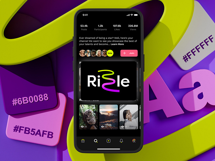
Rizzle began when visionary founders and a small team of developers partnered with us to create a premier discussion platform for the Instagram generation. Initially focused on a specific audience, the app’s core features were carefully designed.
Starting in late 2018, our collaboration aimed to craft an engaging user experience. As we progressed, challenges became increasingly intricate, particularly during ideation and prototyping. Catering to a tech-savvy and socially active user base demanded ongoing innovation, thorough testing, and continuous user feedback. We tackled complex prototyping, numerous animations, video creation features, and enhancing user engagement.
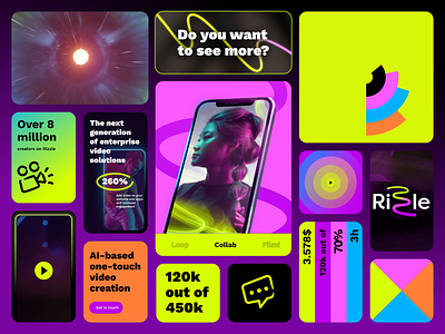
Developing a brand identity was vital; inspired by the simplicity of touch, the curved line symbolizes ease and creativity, representing our commitment to human interaction. This foundation was key to our growth and success, culminating in Rizzle's peak with over 8 million users, 34 million monthly active users, 40 million channels, and 200 million videos created.
Though the product has evolved, these accomplishments underscore the impact of our collaboration.


